Title Sequence idea

Our title sequence idea is to create a yearbook which is opened by all the conventional characters that are seen in teen comedy dramas, for example 'the jock', 'the elite', 'the freak' and 'the nerds'. The title sequence will show all of these characters opening the yearbook and showing the audience their school photos whilst also showing pages such as prom day and graduation day. When creating the title sequence we need to make sure that it is very conventional, this is so it looks as realistic as possible, without the right costume and props the title sequence will not be as effective. When creating the sequence it is crucial for us to add in bright bold colours throughout the yearbook so the audience are aware that it is a high school film.

Thursday, 10 March 2016

'The Jock' scene

Today, I recruited two year 11 boys to be our jocks within the sequence, for the sequence we made them wear white t-shirt and tracksuit bottoms to help convey the jocks 'cool'
style. For the title sequence Tommy had to pose with brushing his hair back whilst Oliver posed by touching his facial hair. Once filming the boys i put the clips onto final cut pro to add it into the sequence. To add both the boys into the sequence me being the editor had to overlap the videos onto what we videoed of the book opening.Following on from this we filmed our main jock finding the book and carrying it to the sports hall, we had used Jacob in our title sequence when it shows the characters within the yearbook,  due to Jacob not being able to film today we had to use James instead, however within the title sequence this is not noticeable. Whilst i filmed two of the jocks Jazmine and Bronte went out and filmed James walking with the book into the Basketball court, this is where he opened the yearbook and looked at the photos of himself, Tommy and Oliver.

This is the Jersey we got the main jock within our sequence to wear, like The freaks outfit the Jersey is very conventional to the genre of the sequence.

Feedback


From our feedback given me from our peer group me, Bronte and Jazmine gained some constructive criticism and came to the conclusion of what we need to do to help improve the sequence, these include; Re-shooting some scenes, making sure the camera is not shaky, Making sure the pictures are already on the page rather than them just popping up whilst making sure they are shown quicker, cut some shots and re shoot using cut shots to help get a fast paste to the title sequence. 

Music choice

To help decide what non copyrighted music we would use, i went onto bensound.com and tried to find the music i believed would best fit our light hearted title sequence, the music i was looking for needed to be fun and fast paced, just like our title sequence. On the website i had found three songs that i believed will fit the title sequence, however from this i did not just choose the song i liked most but decided to put them into a questionnaire on my blog, this questionnaire last until the end of march, whatever one is the most popular will be put onto the blog, as it stands the music with the most votes is 'happy-rock' with three votes.

This is a screen shot of the questionnaire;                                                                                      


I used a questionnaire to help decide what song to use due to wanting to know what others believe will fit the title sequence the best, this way not only do we have the use of mine, Jasmines and Brontes feedback but also the rest of the class.

Wednesday, 9 March 2016

'The freak' scene

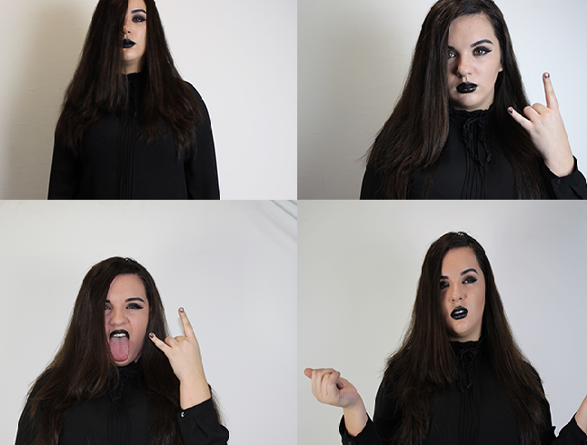
Today me, Bronte and Jazmine filmed Jazmine being 'the freak' clip in the title sequence, the settings we had used were the school toilets, we used the down stairs unisex toilets as we believe they represented a US style. Within the toilet we filmed the birds eye view shot of the freak opening up the yearbook to see her image within the book, within these pages it also showed 'Universal presents a JBB production' and Bronte Humphrey's being the director. On this shoot due to Jazmine having to film i took over and was the cinematographer whilst Bronte took care of the lights. Once this was shot we filmed Jazmine throwing the yearbook into the bin, which had soon fell on the floor, after this the next part that will be needed to film is James being the jock and finding the book on the floor, which he takes to the basketball court and this is where he opens the book. The picture below shows the settings we used to film the freak opening the book.


When filming the 'Freak Scene' this is the costume we used, we decided for the goth to wear all black costume, this is due to believing that it helps illustrate the freaky, gothic feel we wanted Jazmine to look like, with the costume we also made sure that Jazmine had very dull make up on with black nails. For our title sequence we had to make sure our mine-en-scene is appropriate for the diegesis within the film so that is allows us to convey the American high drama conventions throughout our sequence.

Friday, 4 March 2016

The Jock page

The Jock page -
Throughout the Jock page we stuck with the American Blue, White and Red colour scheme, this was to allow us to identify the audience with not only them being sporty but also patriarchal. Although it is obvious to acknowledge that they are athletes we used sport trainers and a basketball to help convey it that little bit more.

Thursday, 3 March 2016

The Elite page -

The Elite page-
The Elite girls had the shading of pink throughout their yearbook page, the typography was pink, their characters boarders were in the shading of pink and the stickers on the page were pink also. The shade pink was used to show their girly, outgoing personalities. We had a pink heart set in the middle of Ellie and Ella's images and underneath them they had a sticker say "perfect" I cherish the "perfect" sticker as it states they are the prominent young ladies and are superior to anything whilst also representing their sassy personalities, which is additionally how they are appeared in American secondary school movies. At that point underneath Emma Roberts picture it say "Queen B" with a crown above it, this shows she the primary 'bitch' whilst being above her side kicks. Although we did represent the Elite girls as pretty and perfect we also wanted to add the Queen B typography to allow the audience to become identified with their bitchy characteristics and although they may look pretty and innocent their personalities are far from this.

Wednesday, 2 March 2016

The Geek page

The Geek page -
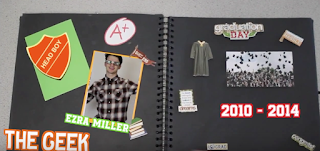
Although i have recently mentioned the freak page and how she is the only character upon her page which conveys the audience her loneliness, the Geek is also in the same position of having no one else but himself upon his page however the geeks page is full of stickers which included the yearbook badge, books, a flag with 'success' wrote across the top and a badge that states head-boy, therefore although he is on his own unlike the freaks page his yearbook page is a lot more interesting, which again fits with his quirky personality. Although the Geek is on his own this does not convey that he is lonely, this is due to him having a Head boy badge, if you want to be head boy you have to be elected therefore the audience are identified with the geeks slight popularity.

The 'Geek' scene

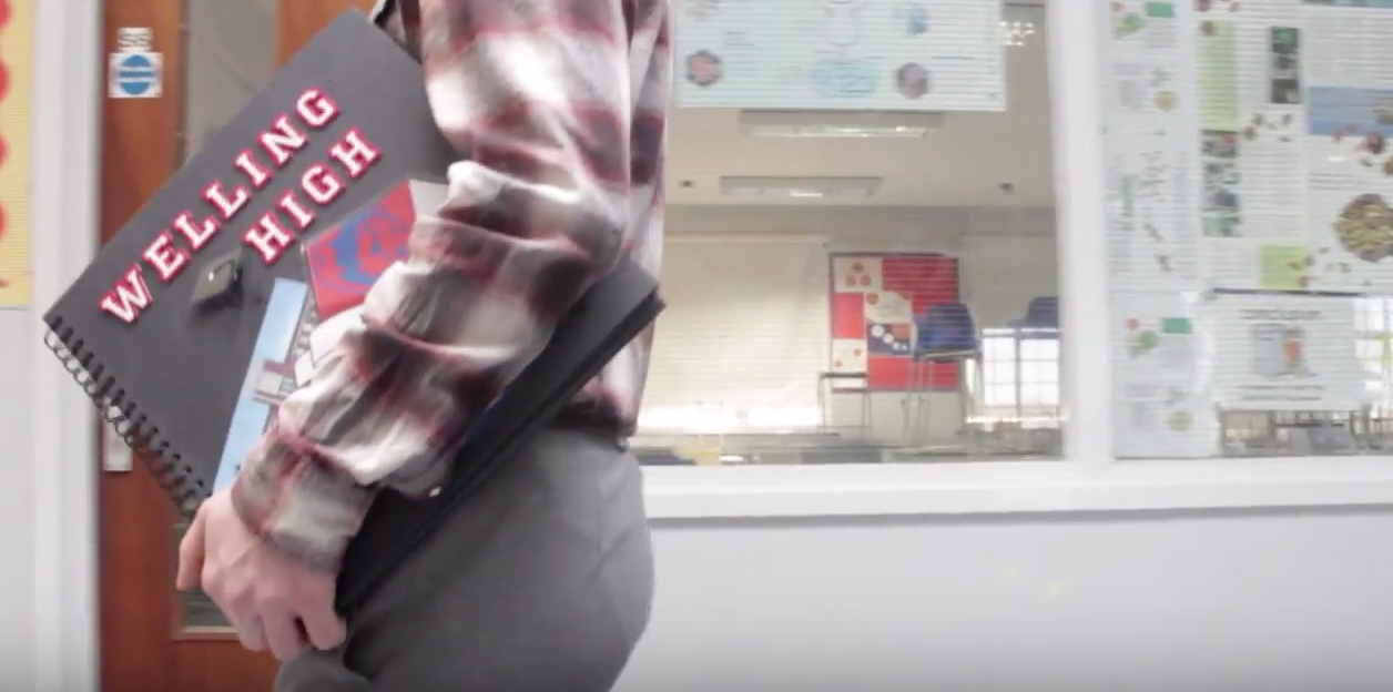
Today me, Jazmine and Bronte went out to film the geeks scene, the geeks costume required a checkered shirt, grey trousers that would show of his ankles and some glasses with tape wrapped around the middle. We wanted to make it clear that from the beginning of which you see the geek, you will be notified straight away with his character role from the way he walks and the way he dresses. Like all of the other characters we had to make sure that the setting would fit perfectly with the character, therefore for the geek we had chosen the science corridor, this ended up being a really great corridor to film in due to the excellent lighting.

We began filming the geek walking with the book with the corridor i'm the background, we wanted to film the geek from different angles, this is so when we go to edit then watch the sequence its not in the same position as this could become a little boring to watch. With the editing of the different angles we was very lucky that the continuity of the different angles had flowed together really well.


Once we had filmed the geek from different angles we had then went on to filming him within a classroom and opening up the yearbook. The Geek was the last character to open up the yearbook, therefore when we created the yearbook we added in pages that would fit in well with its characteristics, for example a graduation page was added had 'success' wrote over the top of the page, this went well with Geek due to him being successful throughout his school years which the audience are given a hint at when they see the geek page and are notified with the 'Headboy' page.

Tuesday, 1 March 2016

The Freak page

The Freak page-
Each yearbook page represents a character and their characteristics,unlike the other social groups within the yearbook the freak was not given a border for her yearbook image, this was due to us wanting to get the message across to the audience of her dull and bland personality. The freaks page had only two images added, these included of some black nails and a skull, again this was done to help convey to the audience her tedious, and boring personality. The colour scheme of the freaks yearbook page was very drab with us only using a colour scheme of shades, for example lots of black,white and greys. Dissimilar from both the Jock and Elite page we see the freak with only herself on her page, she is not surrounded by friends like the social groups mentioned are, we did this to heighten the audiences understanding on the freaks loneliness within the film.

Typography

The typography for our film became a huge aspect that we had to get right, for the title of our film 'Welling high' we had decided not to use dafont but to visit hobby graft and find letters that we believed would perfectly fit the genre, which luckily we had found. The typography we had used for the names of the characters within the film and the title of the film were very old school american, with a bold outline, they had looked like this - 
When creating the sequence we did come to conclusion after using 6 packets of the writing that there would not be enough for us to use them for the characters names as well, therefore we went to dafont and had used the font name 'BeTrueToYourSchool' - which had yet again fit in perfectly with our american high school genre.